I’ve switched over to the Google Assistant app as “the official way to use Google on my phone.” Having the chat thread there to reference the last few things I’ve searched is great, and the suggested actions are generally useful.
Irene’s deeper point is that great design in the things we use can help us overcome negative emotions like fear, greed, and attachment. This lines up nicely with Palladio’s assertion that being in a great structure can help us achieve calm, harmony and dignity.
In a nutshell, since things can be better, we can be better.
“Real people know that anyone can have the great idea. Anyone can have the great idea, and real people see the great idea instantly. They don’t hold on to theirs anymore; they see a great idea, whether it helps, instantly. People with real talent, they don’t worry about that stuff. It’s the people with not enough talent that you argue with.”
Work with management and redirect their energy like an akido master. Don’t fight when their design ideas aren’t great; instead, figure out a way to be “facing the same direction.”
Focus on working through the risky elements of your product or service first, and don’t be surprised if it pulls you out of your personal comfort zone. If it didn’t, it wouldn’t be risky!
Avoid spreading your design team too thin by setting priorities with senior management. Make sure to include a choice for teams to complete less important projects without design, and communicate what that means.
Set tight “learning deadlines” to avoid over-polishing a given idea. It’s not always obvious when designers should put their pencils down.
Design activities should be done by everyone on the team—at least a little—to instill the sense that design is everyone’s job. Developers can watch usability tests and go on site visits, for example.
At the end of the session, there was a brief Q&A in which someone asked about how to balance science with art and go with your gut. I really liked Braden’s answer, which I’ll paraphrase:
When there’s no hard data available, make decisions by identifying who has the best instincts for that type of decision, whether they be a visual designer, sales rep, support agent, or the CEO. Let that person decide, and call out the fact that you’re in subjective territory.
If you’ve ever been part of a user-centered design project, you’ve probably heard the term persona when referring to something like this:
It appears to be a bio for a fictional person, meant to represent a specific type of user of your product. Typically, someone compiles a slide deck containing a handful of different personas, and that deck is presented to the team. Everyone is then supposed to “keep them in mind” during the design phase so the resulting product “works for them.”
There’s only one problem: you can do all that and not improve your product in any meaningful way.
The salient fact about design personas is that most “designers” don’t understand them and use them wrong.
That’s a quote from the inventor of personas (and Visual Basic, among other things). The trouble is, there’s a lot of nuance to creating and using personas effectively. In my experience, it’s really easy for the team to slip up somewhere along the way. So what should we do instead?
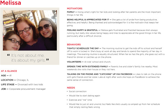
Imagine you’re setting up a tent, and you’re trying to place the minimum number of tent poles in the optimum locations to get the most coverage. The poles are your personas, and what you’re covering is your target market.
So in a health care app, for example, you might have the following personas:
Julian, a physician who only needs to use a few key features of the system, but is impatient with technology
Lou, an elderly patient who has trouble with vision and fine motor control
Carol, a nurse who does the bulk of the heavy lifting in the app while juggling a massive patient load
All three personas “stretch the tent,” applying pressure on the design. To improve the product, the team might remove some friction for the physician, increase accessibility for the patient, and build some extra power user features for the nurse.
Each additional piece work contributes to a business goal: increasing the number of customers that can be served. If each of these demanding user’s needs can be met, the product will slightly overserve everyone “behind” them who’s not as demanding.
We used this technique in some recent work we did building a recruiting system. The behavior pattern we noticed was those asked to interview candidates do so “on the side” and aren’t deeply engaged with hiring. Hence, we created a way for them to view a candidate’s resume without even logging into the recruiting tool.
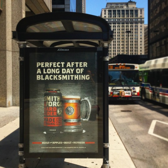
Meet Cornelius
MillerCoors takes this to a comical extreme with Cornelius, the lead character in a new series of ads for their Smith & Forge brand of hard ciders. Cornelius, and his extremely manly associates, enjoy a Smith & Forge beverage after a hard day’s work in the 19th century: blacksmithing, chopping down trees with an axe, and so on.
The message is simple: if this drink is manly enough for him, it’s manly enough for you.
There are two kinds of designers: those who’ll admit they’ve had trouble handling feedback, and liars. That’s why the new book Discussing Design: Improving Communication and Collaboration through Critique caught my attention. The authors (Adam Connor and Aaron Irizarry) shared a number of useful concepts around design critique that I folded into our process. This post is an overview of what we changed; I encourage you to read the book and apply the lessons in your work.
The Bigger Picture
The improvements we’ve made around critique act as a bookend to another recent process change in how we collaboratively generate a high-level design direction for a given set of features. Simply put, we come up with the basic ideas together, and we evaluate the full-fidelity designs together.
This is a subtle point, but it’s critical. Since all of our fingerprints are on the designs, no one feels like they’re in front of the firing squad during the critique. Even if one person did the lion’s share of the detailed design, they can still switch hats and be a critic.
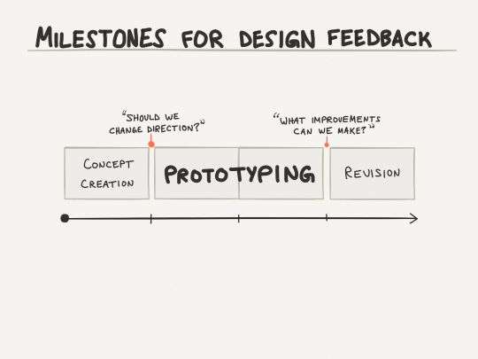
The 75/25 Process
As it relates to critique and iteration, the basic process is as follows:
Collaborate on the high-level design direction for a given set of features, but don’t use more than 25% of the available time.
Pause and evaluate the design concept against the higher-level project and business goals. (Whenever possible, also compare it to what you’ve heard from customers and users.) Decide whether you need to change direction, then select a solution.
Prototype that solution, but don’t use more than 75% of the available time.
Pause and analyze the effectiveness of the prototyped, high-fidelity design relative to the finer-grain objectives of that specific design. Identify improvements to make.
Use the last 25% of the time to make as many of the improvements as possible.
The 75/25 rule sounds a little arbitrary, but I borrowed it from Pixar. Without Lean-style pivots, a quarter of the way through is about the last responsible moment to change direction. And to make non-trivial improvements, developers will need at least 2-3 days in a typical two-week cycle (i.e. 20-30% of the time).
You can also look at the flip side: early on it’s too soon to nitpick, and later on it’s too late to make fundamental changes. In the middle, you mostly have to leave people alone and let them work.
Critique: Effectiveness Analysis
Adam and Aaron’s book gave me what I was missing to structure the critique session into something that’s a useful input to design. First, framing the session as one focused on analysis gets people into a critical thinking mindset. Try your best to keep people in an evaluative mode instead of slipping into a problem-solving mode. (There’s no magic trick to this; just stick to your guns and emphasize that you really want to devote this time to smoking out all the improvements you possibly can.)
A natural extension of the analysis is an articulation of the objectives. (I specify the key objectives in writing.) Explicitly discussing your targets is key to knowing whether they’ve been hit. In the book, the authors use the term “objectives” as a catch-all to capture anything the design should be factoring in:
Your personas and their goals
Your project’s business goals
The scenarios that have touch points into these features
Any design principles agreed upon by your team
Any relevant best practices for your target platform
and so on…
Depending on your culture, having a forcing function for a discussion of objectives might just be the biggest impact of properly managing design critique.
When the Going Gets Tough
The thing I’m most grateful for about the book is the frame of mind that helped me come up with these sentences during some uncomfortable moments:
“I hear what you’re saying about that [specific design element]. Can you tell me more about the problem you feel is inadequately solved by what we’re seeing now?”
“I can tell you’re not in love with this, and that’s OK. Which parts of this design seem to lack effectiveness?”
“Hmm, that’s interesting. I wonder if we should reframe this objective, perhaps significantly. Or have we identified an entirely new objective?”
“That’s a powerful idea, but it would take us in a new direction. Can I talk to the development lead and get back to you?”
Stakeholder issues a directive; “We can take that specific directive, but I’d like to go further; anything you can tell me about the line of thinking behind that will help me apply the same idea elsewhere.”
Though you might be bracing for impact, you may very well hear reactions you don’t expect. Depending on their personalities, some stakeholders may not make any decisions on the spot and ask for time to think things over. This feels anticlimactic, but it’s healthy. I think it’s part of the reason why the authors included a detailed example of sending the stakeholders the designs in advance(!) so that they can mull them over beforehand.
Are You Ready to Get Better?
I would definitely rather hear gushing praise instead of outright insults, but neither contain information I can use to improve the design of a product.
So why not use every available method to make things better? If Pixar does it, shouldn’t you? If engineers do code reviews, shouldn’t you do the same?
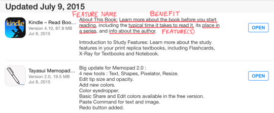
Amazon.com kicks off new product initiatives by writing a hypothetical press release announcing the arrival of the product, then iterating on that message until the vision is sufficiently compelling. It’s a fantastic technique, but it results in a few hundred words. Their release notes, however, provide an example of how to distill that message into a (much shorter) elevator pitch.
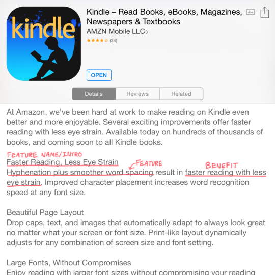
Here’s a recent update to the Kindle app:
First, they introduce the new feature—branding it, if you will. Then, they call out the benefit the feature creates. Finally, they list the actual feature(s) and provide some details on what it does.
The subtle, but critical ingredient here is highlighting the benefit users will get. If you scroll though your app updates, you’ll see that’s few and far between. Most vendors just list the features, like the one that happened to follow Amazon here:
A prior update to the Kindle app followed Amazon’s pattern:
The branding is not as strong, but we still see the benefit—even though improvements to typesetting and visual design can be tough to capture in words.
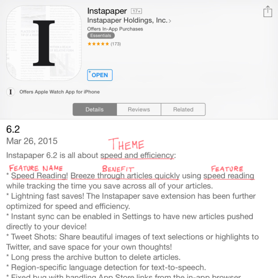
Instapaper had a theme for a recent release, which gave them an easy way to explain why a certain set of features arrived together. Without that, a update can feel like a grab bag with no clear “hook” for customers to understand it holistically.
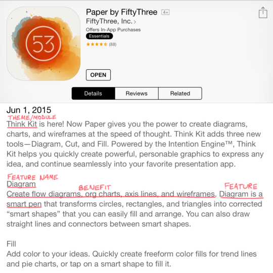
FiftyThree did something similar when releasing a new module for their Paper app. They introduce/brand it, give a quick overview, and then touch on each tentpole feature and the benefit it provides. In their case, that translates to an easier way to accomplish what was tedious in the past.
Adding the “Who”
If you’re building technology for the enterprise, you’ll probably need to include the target user(s) served by the new feature, for example:
System administrators can protect corporate data if a mobile device is lost or stolen with the remote wipe capability introduced with iOS 4.
Once you add that element, you have something that lines up nicely with the Customer-Problem-Solution framework from Lean Startup. If you’re already using that approach, you’ll have a great starting point for this exercise.
Whatever you do, begin with the end in mind so you have more than a list of features when it’s time to ship. Remember: code is a liability. The benefit it creates is the asset.
Becoming Steve Jobs, the new book by Brent Schlender and Rick Tetzeli, is a great read for those that want to know more about the man himself. I came away from the book with an understanding of Steve that was more nuanced and three-dimensional.
Don’t expect to find lots of tips for how to create great products, however. Steve’s story includes that, obviously, but it’s not the focus of the book. Still, two ideas stuck with me:
Maintain your focus on the few pieces that are truly important. Don’t get distracted with the million other things in this world. Say “no” a lot and let other things slide.
Develop an organizing principle—a clear “why”—behind what you’re doing. Your customers will eventually need to hear it, and your team can’t fully get on board with a plan they don’t understand.
So if you want to know Steve, read this book. But if you want to be Steve—and guide smart people to create incredible things—start with Ed Catmull’s Creativity, Inc. I’m planning to go back and re-read it now.
You look like a smart cookie. You already know starting your software effort with a giant requirements document isn’t the best plan. (Much has been written about that, though I have a favorite.) It’s counterproductive to pretend like you know every detail of what you’ll build before you start.
On the extreme other end of the spectrum, you can question every assumption, choose a few key targets, and test multiple ideas to see which hits those targets best. (Much hasbeenwritten about that, too.)
But what if you’re in the middle?
What if you’ve got a feature idea that “has to get in”—don’t gimme that look, it still happens—but you’ve got wiggle room on the specifics? Or maybe you already have validated learning behind the basic concept, and now it’s time to flesh it out further? How do you present this to your team?
To be more specific: what’s the best way to engage your development and testing teams on a new idea so it becomes a robust feature by release time?
My strategy is to give the team an overview of the feature, and then work together on all the picky details.
The Anatomy of a Feature Overview
The Feature Overview has a few different pieces to it, and a minimum of jargon so non-technical folks can follow along.
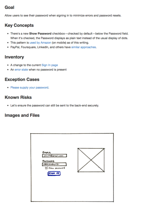
There are five or six sections, depending how you count it. Here’s a sample.
Goal
Part of our culture at Appiphony is asking, “what’s the goal?” at the start of anything. (It’s great for meetings; try it sometime.) I often go with a simple “Allow users to…“ since that’s natural for developers. If you want to zoom out a bit, that’s great too; you can phrase it as the user’s goal or maybe use a job story. Just make it clear what success means.
Key Concepts
There are usually a few critical things the team needs to understand about a design to fully “get it.” This is where I include those. If I can anticipate some questions ahead of time, I’ll answer them preemptively. You may also want to call out something that’s easy to miss, particularly if it’s tricky to implement. Direct their attention.
Inventory
This is a flat list of each component that’s part of the design. In addition to the screens, don’t forget copy for error/information states, subject lines and body text for email templates, and anything else that needs to be coded or tested. Review this list multiple times.
Exception Cases
I call this out as a separate section because I usually forget some of them, and my partners in QA swoop in and help. They’re almost always able to spot one or two “unhappy paths” through the flow we need to smooth out.
Known Risks
There may be parts of the design that simply can’t be built within the time and budget constraints. Call these out if you know them, and don’t be surprised when the developers add to the list. Once the concerns are all on the table, assign tasks to write just enough proof-of-concept code to determine if the design needs to change to account for reality.
Images and Files
This is a separate section in my document that functions like a list of appendices. Depending on the tools you use, you may be able to place the attachments inline where they apply to support your ideas with visuals. Don’t just use words.
The Point
To paraphrase Scott Berkun, nobody wants your requirements. They’ll be OK with theirs, though. Engage your people to define the details and everyone will benefit.
You hired smart people, right? Bring your technical teams ideas at a medium level of grain and tap into their talents. They’ll contribute ideas you never would’ve considered, and some you didn’t even know were possible. You’re a smart cookie, but not the only one in the jar.
I’m one of those people who loves to see the details of how others do their jobs—especially if it’s similar to mine. So I was very grateful when Abi Jones, a designer on Google’s Search team, tweeted a UX comic she drew at work.
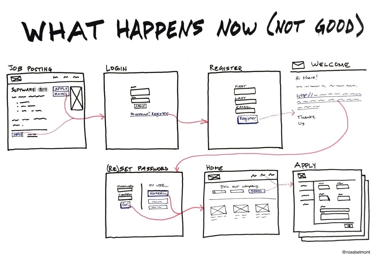
The lack of ceremony is great, but the light bulb moment for me was the contrast between the suboptimal current state and ideal future state. I realized the majority of my design work is for net-new functionality, and I needed a different way to pitch reworking something we already have. I made two separate images, but ideally they would fit on one page.
Most insurance plans won’t cover a cost that high, only to do so again and again as the child grows. This innovation provides a practical solution to that very real business problem. This is design and technology, working together at their best.
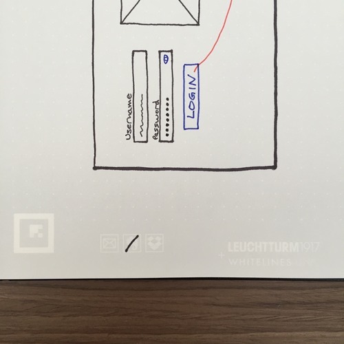
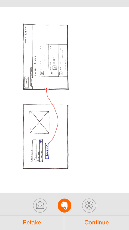
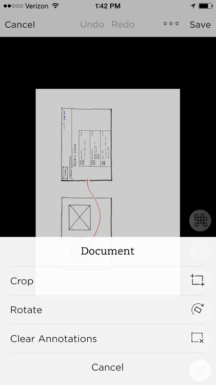
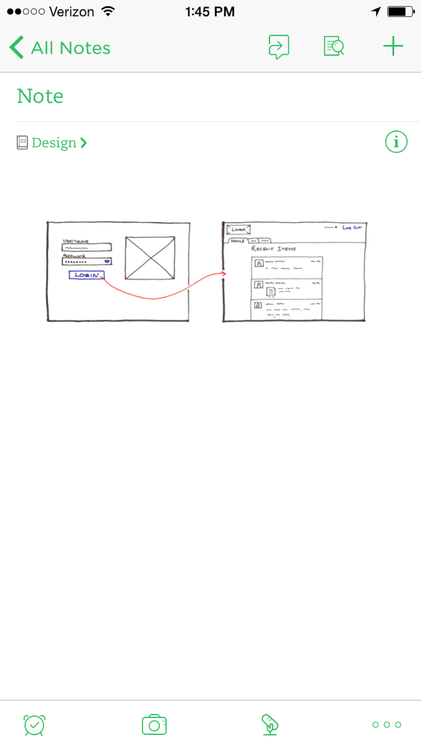
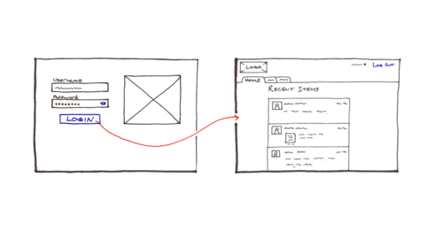
Much like The Most Interesting Man in the World, I don’t always create detailed UI sketches. But when I do, I find it faster to create them on paper. So what’s the best way to share them with the team?
After lots of experimenting, I’m pretty happy with the Whitelines Link system. Here’s how it works.


