Use Personas to Serve Your Demanding Customers

If you’ve ever been part of a user-centered design project, you’ve probably heard the term persona when referring to something like this:

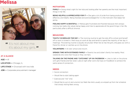
It appears to be a bio for a fictional person, meant to represent a specific type of user of your product. Typically, someone compiles a slide deck containing a handful of different personas, and that deck is presented to the team. Everyone is then supposed to “keep them in mind” during the design phase so the resulting product “works for them.”

There’s only one problem: you can do all that and not improve your product in any meaningful way.

The salient fact about design personas is that most “designers” don’t understand them and use them wrong.

— Alan Cooper, March 26, 2013

That’s a quote from the inventor of personas (and Visual Basic, among other things). The trouble is, there’s a lot of nuance to creating and using personas effectively. In my experience, it’s really easy for the team to slip up somewhere along the way. So what should we do instead?

A Useful Tip

One great piece of advice came in the form of a metaphor from Jonathan Korman during CooperU’s UX for Product Managers class:

Imagine you’re setting up a tent, and you’re trying to place the minimum number of tent poles in the optimum locations to get the most coverage. The poles are your personas, and what you’re covering is your target market.

So in a health care app, for example, you might have the following personas:

  • Julian, a physician who only needs to use a few key features of the system, but is impatient with technology

  • Lou, an elderly patient who has trouble with vision and fine motor control

  • Carol, a nurse who does the bulk of the heavy lifting in the app while juggling a massive patient load

All three personas “stretch the tent,” applying pressure on the design. To improve the product, the team might remove some friction for the physician, increase accessibility for the patient, and build some extra power user features for the nurse.

Each additional piece work contributes to a business goal: increasing the number of customers that can be served. If each of these demanding user’s needs can be met, the product will slightly overserve everyone “behind” them who’s not as demanding.

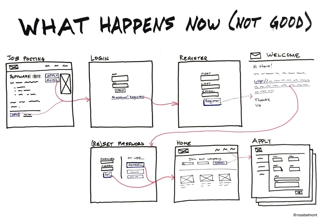
We used this technique in some recent work we did building a recruiting system. The behavior pattern we noticed was those asked to interview candidates do so “on the side” and aren’t deeply engaged with hiring. Hence, we created a way for them to view a candidate’s resume without even logging into the recruiting tool.
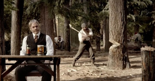
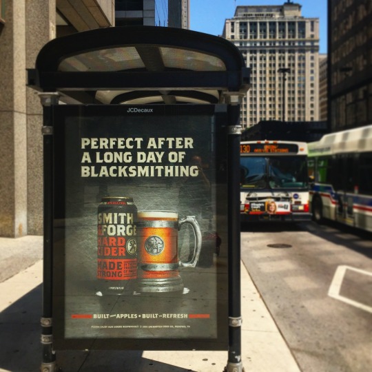
Meet Cornelius

MillerCoors takes this to a comical extreme with Cornelius, the lead character in a new series of ads for their Smith & Forge brand of hard ciders. Cornelius, and his extremely manly associates, enjoy a Smith & Forge beverage after a hard day’s work in the 19th century: blacksmithing, chopping down trees with an axe, and so on.

The message is simple: if this drink is manly enough for him, it’s manly enough for you.

Use a Feature Overview for Kinder, Gentler Requirements

You look like a smart cookie. You already know starting your software effort with a giant requirements document isn’t the best plan. (Much has been written about that, though I have a favorite.) It’s counterproductive to pretend like you know every detail of what you’ll build before you start.

On the extreme other end of the spectrum, you can question every assumption, choose a few key targets, and test multiple ideas to see which hits those targets best. (Much hasbeenwritten about that, too.)

But what if you’re in the middle?

What if you’ve got a feature idea that “has to get in”—don’t gimme that look, it still happens—but you’ve got wiggle room on the specifics? Or maybe you already have validated learning behind the basic concept, and now it’s time to flesh it out further? How do you present this to your team?

To be more specific: what’s the best way to engage your development and testing teams on a new idea so it becomes a robust feature by release time?

My strategy is to give the team an overview of the feature, and then work together on all the picky details.

The Anatomy of a Feature Overview

The Feature Overview has a few different pieces to it, and a minimum of jargon so non-technical folks can follow along.

There are five or six sections, depending how you count it. Here’s a sample.

Goal

Part of our culture at Appiphony is asking, “what’s the goal?” at the start of anything. (It’s great for meetings; try it sometime.) I often go with a simple “Allow users to…“ since that’s natural for developers. If you want to zoom out a bit, that’s great too; you can phrase it as the user’s goal or maybe use a job story. Just make it clear what success means.

Key Concepts

There are usually a few critical things the team needs to understand about a design to fully “get it.” This is where I include those. If I can anticipate some questions ahead of time, I’ll answer them preemptively. You may also want to call out something that’s easy to miss, particularly if it’s tricky to implement. Direct their attention.

Inventory

This is a flat list of each component that’s part of the design. In addition to the screens, don’t forget copy for error/information states, subject lines and body text for email templates, and anything else that needs to be coded or tested. Review this list multiple times.

Exception Cases

I call this out as a separate section because I usually forget some of them, and my partners in QA swoop in and help. They’re almost always able to spot one or two “unhappy paths” through the flow we need to smooth out.

Known Risks

There may be parts of the design that simply can’t be built within the time and budget constraints. Call these out if you know them, and don’t be surprised when the developers add to the list. Once the concerns are all on the table, assign tasks to write just enough proof-of-concept code to determine if the design needs to change to account for reality.

Images and Files

This is a separate section in my document that functions like a list of appendices. Depending on the tools you use, you may be able to place the attachments inline where they apply to support your ideas with visuals. Don’t just use words.

The Point

To paraphrase Scott Berkun, nobody wants your requirements. They’ll be OK with theirs, though. Engage your people to define the details and everyone will benefit.

You hired smart people, right? Bring your technical teams ideas at a medium level of grain and tap into their talents. They’ll contribute ideas you never would’ve considered, and some you didn’t even know were possible. You’re a smart cookie, but not the only one in the jar.

How to Make Paper Sketches Digital

Much like The Most Interesting Man in the World, I don’t always create detailed UI sketches. But when I do, I find it faster to create them on paper. So what’s the best way to share them with the team?

After lots of experimenting, I’m pretty happy with the Whitelines Link system. Here’s how it works.

First, I gathermysupplies.

You’ll notice that the notebook’s “natural” orientation is vertical.

I usually end up rotating it for a wider surface, but not always.

The mark on the left/bottom tells the Whitelines Link app to send this image to Evernote after scanning it in.

Then, I “scan” the page with the app. You can hold your phone at a sloppy angle, but the app seems to require photos to be taken in “portrait mode.”

The app recognizes the image, removes the gray background, and detects Evernote as the destination.

If need be, I crop and rotate in Evernote.

Storing the sketch in Evernote allows me to organize sketches into different notebooks while also making them searchable.

Usually, I export the image to send it to a teammate or post it to Basecamp/Trello/etc. This is an example of the final image people see.

This may seem like a lot of steps, but it’s the shortest amount of time from idea to posted image. Try it for yourself—without the fancy notebook—by downloading and printing a template from the Whitelines web site.

Prototyping Pitfalls

Today, I gave a talk at Prototype Camp Chicago on Prototyping Pitfalls, which amounted to one big story about what happened to our team when we swapped out wireframes and comps for prototypes. Prototypes bring benefits to designers, but introducing them into your process affects everyone else on the team.

We realized if you simply trade static comps for clickable prototypes and change nothing else about your process, you probably won’t get the benefits prototyping is supposed to bring. My hope is that sharing our solutions to these problems will help other design teams thinking of changing how they work.

If you’d like the slides, I posted them on SpeakerDeck.

Look For the To-Dos

Have you ever seen something like this listed in a requirements document?

Financial analysts need to manage the month-end close process

If you’re like me, you may wonder, “what does that mean, exactly? How might one manage a month-end close process?”

The problem is the word manage; it can mean nearly anything. Without being a finance expert, you can understand that you manage a month-end close differently than you manage a summer intern—but, for some reason, we use the same word.

When I encounter a similar requirement, I ask this:

What would someone put on their to-do list to finish this work?

In this case, it might be:

  • Tally the accounts receivable

  • Tally the accounts payable

  • Send a profitability report to the executive team

Now we’re getting somewhere! You can begin to imagine what a user might do to complete those tasks, and how you can help that user.

Don’t Stare at the Scoreboard

tumblr_n8x0b8AaA81sjmd2yo1_1280.jpg
tumblr_n8x0b8AaA81sjmd2yo2_1280.jpg

Analyzing the final product: staring at the scoreboard

Let’s say you’re building a product, and you do some competitive analysis to see how others have addressed the same problem. Sounds reasonable, right?

Here’s the trouble: if you can only look at the final product, and can’t see any of the work that led up to it, you’re missing most of what’s interesting. What trade-offs did the team make based on what they learned along the way? What’s planned for the next release? How did they arrive at their design decisions?

It’s like staring at the scoreboard of a baseball game after it’s over. If you didn’t watch the game, you won’t get much out of it. You missed all the action.

Photos courtesy of Eric Kilby and Keith Allison

The Product Thesis

A concise, easy way to communicate customer needs to design and engineering teams to build the right things.

Answer these questions for the team building your product:

  1. Why are we working on this next?

  2. In what scenario is this used?

  3. What problems do we need to solve?

  4. What future considerations must be accounted for?

  5. How will we know this is a success?

I’ve been thinking about what it means to document and communicate a product at a medium level of grain—between 10,000 feet and the weeds. This helps in that regard.